You’ve spent decades building a nest egg large enough to fund the retirement you want.
The next challenge is making sure it can support that same lifestyle for the next 30 years.
At 3% historical inflation, the $100,000 lifestyle you retire on could cost $240,000 a year by age 90.
And the assets that feel safest — cash, CDs, and money market funds — have historically done the least to keep up.
In this episode, I’m simplifying a century of market history into 8 numbers that shape how long your money lasts.
Here’s what you’ll learn:
- The hidden cost of playing it safe with money you won’t need for decades
- The 2 bond numbers that look nearly identical, and the risk hiding between them
- How they all fit together into a simple framework for making confident decisions
My hope is that when we’re done, you have a small set of reference points to return to, and a lot less noise competing for your attention.
Listen To This Episode On:
When You’re Ready, Here Are 3 Ways I Can Help You:
- Schedule a Free Retirement Strategy Session. Get your questions answered + learn how we can help you improve retirement success and lower taxes.
- Listen to the Stay Wealthy Retirement Show. An Apple Top 50 investing podcast.
- Join My Retirement Newsletter. Weekly retirement and investing tips (delivered to our inbox!)
+ Episode Charts
+ Episode Resources
- Small Cap Value Investing Series: Part 1, Part 2, Part 3
- Why You Shouldn’t Be Surprised By Your Investment Returns
- Can $5M in T-Bills Safely Fund Your Retirement? (History Says No)
- The Lost Decade Hypothetical Return Data
- 60/40 Long-Term Return Data: Vanguard & NYU Stern
+ Episode Transcript
At 3% inflation, the cost of living roughly doubles every 24 years.
So, a healthy 60-year-old retiring today could see the cost of their current lifestyle more than double before age 90.
That’s the hurdle your retirement savings have to clear just to preserve their purchasing power. And the assets that feel safest — cash, CDs, and money market funds — have historically had the hardest time staying meaningfully ahead of it.
In this episode, I’m breaking down eight important numbers you need to know from a century of market history. I’ll share what each number is, why it matters specifically to you as a retirement saver, and how they fit together into a simple framework for making better investment decisions.
My hope is that when we’re done, a lot of the daily noise gets a little quieter.
Welcome to another episode of the Stay Wealthy Retirement Show. I’m your host, Taylor Schulte, and every week I cover the most important financial topics to help you stay wealthy in retirement. Ok, onto today’s episode.
8 Investing Numbers That Shape Whether Your Nest Egg Outlives You
Number 1: 3.0%
Let’s start with the number that works against you every single day: 3.0%.
That’s the long-term rate at which the things you spend money on have risen in price over the last 100 years. Groceries, gas, healthcare, travel, a new roof.
We call this number inflation, and while 3% a year might not sound like much, it compounds against you in exactly the same way that investment returns compound for you.
Here’s what that means in real life. At 3% inflation, the cost of living roughly doubles every 24 years. So if you’re a healthy 60 year old today and you live to age 90 — which is a very reasonable planning assumption — the prices you pay will likely more than double over the course of your retirement. In other words, the same lifestyle that costs you $100,000 a year on the day you retire could cost you somewhere around $240,000 a year near the end.
This is why, even in retirement, a positive return usually isn’t enough. It’s tempting to think that once you’ve stopped working, your only job is to protect what you’ve built and avoid losses. But if your money merely keeps pace with 3% inflation, you’re standing still. And standing still over a 25 or 30-year retirement means losing ground every single year.
So think of 3% as the hurdle rate. From here on, every number we discuss only means something in relation to that benchmark. Keep it in the back of your mind, because we’re going to come all the way back to it at the very end.
Number 2: 3.3%
Once you accept that 3% is the hurdle, the next question is what it costs to clear it. And that brings us to the second number: 3.3%.
3.3% is the 100-year return on so-called “risk-free” Treasury bills, often referred to as T-bills. And T-Bills behave a lot like the CDs, the money market funds, and the high-yield savings accounts that many of you are holding right now.
The prices don’t fluctuate, they are safe, and they pay substantially more than your big bank checking account.
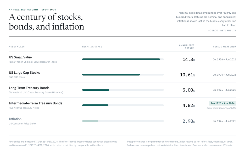
But look at that number again — 3.3% — and compare it to the first number, inflation at 3.0%. Over the long run, cash as represented by T-bills has barely stayed ahead of the rising cost of living.
This is the first rule of investing, and it’s a rule the other six numbers keep confirming: there is almost no such thing as a free lunch. If you want a higher rate of return on your investments, you generally have to accept more risk. And the flip side is just as true. If you avoid risk entirely, you should expect to earn very close to nothing after inflation.
Now, I want to be clear here. I’m not saying cash is bad. Cash is exactly the right tool when you have a short-term need — money you know you’ll need to spend in the next few years, or an emergency reserve you never want to see drop in value. No risk, no reward, and in some cases no reward is exactly what you want.
But the pattern we see over and over is people holding far more cash than their short-term needs require. They’ve got money they won’t need to touch for 10 or 20 years sitting in a savings account because it feels safe. And it’s hard to blame them, especially over the last few years, when cash has finally been paying meaningfully more than it did for most of the prior decade.
I’ve covered this at length before, back in episode 243, on the hidden risk of “high-yield” cash in retirement, and again in episode 293 when we looked at whether $5 million in Treasury bills could fund a retirement on its own. The conclusion in both was the same. Over long periods, cash and T-Bills are designed to keep up with inflation at best, not beat it. Put simply, they preserve dollars, but they don’t grow your purchasing power.
Which leads us to the third number and naturally raises the question: what happens if you step just slightly out onto the risk ladder?
Number 3: 4.8%
When you move money out of Treasury bills (i.e., cash) and into short-term bonds, the 100-year return climbs to 4.8% per year.
Now, by short-term bonds, I’m specifically referring to five-year Treasury notes — high-quality bonds with maturities of roughly five years or less.
With an annualized return of 4.8%, that’s an extra 1.5% per year over cash, in exchange for accepting a modest amount of additional risk.
And that 1.5% is important. Remember, t-bills cleared inflation by about three-tenths of a percent. Short-term bonds, on the other hand, have delivered some real, above-inflation growth while still staying relatively stable.
So why would a retiree own short-term bonds at all? Well, there are two reasons.
The first is that their primary role is to stabilize the portfolio. When stocks go through difficult time periods and experience catastrophic losses, high-quality short-term treasury bonds have historically held their value reasonably well, and in some cases, produced a healthy positive return. With that asset class in your portfolio, you have something you can spend from without being forced to sell your stocks at a bad time.
Long-time listeners have heard us describe this as part of your war chest. At our firm, that’s typically two to three years of living expenses held in cash and high-quality bonds, and up to five years of expenses for the most risk-averse retirees who want to be prepared to weather the worst of storms.
The second reason a retirement saver may want to allocate to short-term bonds is that they have, historically, helped to smooth out the ride. Not everyone is comfortable owning a portfolio made up entirely of stocks, and frankly, most retirees shouldn’t be. A slice of short-term bonds is often what makes it possible to stay invested in the assets that do actually grow your wealth over the long-term.
So while 4.8% may feel like a meaningful step up from cash, short-term bonds aren’t there to grow your wealth. Their job is to provide stability, fund spending during bad markets, and help keep a downturn from dictating your retirement paycheck.
Now, if taking a little more risk earned you an extra 1.5% per year, the obvious next step is to keep moving on up the ladder. Which brings us to the fourth number you need to know, and I think it’s the one that surprises people the most.
Number 4: 5.0%
The fourth number is 5%, and it represents the annualized return of 20-year US treasury bonds over the last 100 years.
Now compare that with the number we just covered. Five-year treasury bonds returned 4.8%. Twenty-year treasuries returned 5.0%. So historically, extending from five years all the way out to 20 years only earned you about two-tenths of one percent more per year. But the risk increased by much more than that. Here’s why.
As bonds mature further into the future (5 years from now, 10 years, 20 years), they generally have greater duration. In plain English, greater duration means their prices are more sensitive to changes in interest rates.
As a rough example, if yields rise by one percentage point, a five-year Treasury might fall around 4% to 5%. On the other hand, a 20-year Treasury could decline by 12% to 14%. So, you’re taking approximately three times the interest-rate sensitivity for only a small increase in historical return.
The exact numbers depend on the bond’s coupon, yield, and a few other factors, but the broader lesson still stands: taking substantially more duration risk doesn’t necessarily produce substantially more return.
And that seems to challenge the principle we started with: if you’re willing to accept more risk, shouldn’t you earn more return? Generally, the answer is yes, but this serves as an important reminder that blindly taking more risk does not guarantee you’ll always be compensated for it. What matters is which risk you’re taking. And historically, extending maturity in the bond market hasn’t worked out particularly well for investors.
Naturally, if you’re going to accept more volatility in your portfolio, you want to be paid accordingly for it. And that’s where the next asset class comes in.
Number 5: 10.5%
Number 5 is 10.5%, which is the annualized return of owning a share of every publicly traded company in the United States over the last 100 years.
And this is where most investors have a strong reaction. When people hear the word “stocks,” they usually think “risk.” It’s a fair response, stocks do contain more risk than bonds, but I want to push back on that feeling a little.
Stocks are not lottery tickets or slot machines. A stock is an ownership stake in a real business, including many of the companies you interact with and happily give money to every day. The company that makes your phone. The one that delivers packages to your door. The bank that safely holds your money.
When you own the stock market through a broad-based index fund, you own a slice of all of them. And over time, many of those businesses get better at what they do. They grow, become more profitable, develop new products, and expand into new markets. As the businesses become more valuable, so does your ownership stake. Not in a straight line, of course – stock prices can move around dramatically in the short-term. But over long periods of time, the direction has historically been up.
Let’s go ahead and put some numbers around that 10.5% return. At that rate, every dollar invested doubled, on average, about every seven years. One dollar becomes two. Two becomes four. Four becomes eight. That’s compounding, and it’s why I believe owning public companies has been one of the most powerful tools available to ordinary investors for building and preserving wealth.
Yes, stocks fluctuate far more than short-term bonds. But as we just saw with long-term bonds, volatility by itself doesn’t tell you whether an investment is attractive. The question is what return you’ve historically received for taking that risk. And over long periods, stocks have compensated investors very well.
Up to this point, though, we’ve treated the stock market as one thing. But it isn’t. Different types of companies have produced very different results over time, which brings us to the sixth number.
Number 6: 14.3%
Number 6 is 14.3%, which is the 100-year return for Small Value stocks. Put simply, these are smaller companies trading at low relative prices — the unloved, unglamorous, overlooked parts of the market that nobody is especially excited to own.
And over the last century, that corner has compounded at roughly 4% more per year than the broad U.S. stock market as a whole.
If you want the nerdy details on why that outperformance exists, I’ve done a few past episodes on the topic and I’ll link to them in today’s show notes. But the short version is this. Smaller companies are riskier than larger, more established ones, and historically, investors have been rewarded for taking that risk. On top of that, a company trading at a low price relative to its fundamentals has higher expected future returns. That’s what we mean by a “value stock.”
The value piece is less intuitive than small company versus large, and the best explanation of it I’ve heard came from my friend Rubin Miller when he joined me on the show a few years back. His point was that every single stock has to be owned by somebody. So the question becomes: how does the market convince people to own the less exciting companies, the ones without the great story, the shiny products, or the smartest people in the room? The answer is, it has to offer investors a slightly higher expected return. That’s the whole mechanism, and it reminds me of a line often attributed to Warren Buffett where he says:
“The stock market is the only place where things go on sale and everyone runs out of the store.”
Ok, so let’s come back to that 4% of outperformance, because 4% may not sound like much until you compare it to something. The entire reward for moving all the way from long-term bonds to stocks is about 5.5% a year. So, the Small Value asset class captured roughly 70% of that spread a second time, just from tilting toward smaller, cheaper companies in the portfolio. Over decades, a difference like that is significant.
Now, to be clear, I’m not suggesting you put your entire retirement into small cap value and expect 14% returns. That outperformance is not guaranteed, and this asset class has endured long, uncomfortable stretches of underperforming the S&P 500, sometimes for a decade or more.
As my friend Brian Portnoy says, “diversification means always having to say you’re sorry,” and small cap value is a good recent example.
The outperformance also doesn’t arrive in small, steady increments. Historically, much of it has shown up in short, powerful bursts, which makes a one-foot-in, one-foot-out approach especially difficult. If you lose patience and move in and out of this asset class, you will almost certainly miss out on the very periods that make it worthwhile. Allocating to small cap value in your portfolio takes conviction and patience, which is why I regularly emphasize that “the best investment is ultimately the one you can stick with.”
But here’s what I find more valuable than the raw return, especially for those in or nearing retirement. Small value stocks don’t move in lockstep with the large, familiar companies that dominate the U.S. market. They may all be publicly traded companies, but they are not all reacting the same way at the same time. So when you build a portfolio that holds large stocks, small stocks, and value stocks together, something useful happens. The portfolio may earn roughly the average of what its pieces earn, but it can do so with less risk than you’d expect from looking at each piece alone. The pieces won’t always fall by the same amount or at the same time, which can make the whole portfolio steadier than its individual parts.
That’s diversification. And it’s often described as the only free lunch in investing — the one place where you genuinely get something for nothing, in the form of more stable returns without giving up the growth.
Which sets up the seventh number, because that free lunch is what most of you are actually eating.
Number 7: Roughly 9%
And that number is roughly 9%, which is the long-term return for the classic 60% stock / 40% bond portfolio.
Here’s what’s genuinely useful about that 9%. You didn’t have to choose between the safety of bonds at roughly 5% and the full volatility of an all-stock portfolio. By blending them, you captured the majority of the stock market’s return while taking on considerably less of its movement. And for someone drawing income from their portfolio, a smoother ride isn’t a luxury, it’s a critical part of what makes the plan work.
This is similar to the free lunch from Number 6, just applied across stocks and bonds instead of across stock asset classes. But I do want to be careful here, because the 60/40 portfolio often gets treated like a finished answer, and I don’t think it should be.
That 9% is a long-term average going back to 1928, and averages can hide a lot. Take the decade from 2000 through 2009, which many of you lived through as savers. The S&P 500 lost about 9% in total over those ten years, with dividends reinvested. A simple 60/40 built from the S&P 500 and bonds did far better and turned that loss into roughly a 33% total cumulative gain. But spread across ten years, that works out to only about a 3% annualized return — against inflation that averaged around 2.5% per year. So the blend absolutely did its job. It just didn’t do much for your purchasing power.
Not to worry, though. We can borrow what we learned from number 6 to combat this, and keep that same 60% stock /40% bond allocation, but build the stock side properly by also including small cap value, international developed and international value stocks, emerging markets, and real estate. Over that exact same decade, a portfolio built that way returned well over 100%.
Same stock-to-bond split, and the difference was roughly 33% versus well over 100%.
So, to sum this up, the stock-to-bond mix is a dial. It sets your overall risk level, and where you set it should depend on your goals, your timeline, and how much risk your plan actually needs to take. Some of you should own more stocks. Some of you should own fewer.
But the dial says nothing about what goes inside each side of it. And that’s the better question to be asking: which asset classes have robust evidence supporting their place in the portfolio, and how much of each should you own?
Which also points us at the last number.
Number 8: About 7.5%
Every number I’ve given you so far is a nominal return. The eighth and final number is what remains after accounting for inflation.
To understand it, we have to go back to where we started. The 3.3% on cash, roughly 5% on bonds, and 10.5% on stocks are all nominal returns. They’re the returns before inflation, and they’re usually the numbers we focus on when looking at investment performance.
But retirement isn’t funded with percentages on a statement. It’s funded with purchasing power, or what your money can actually buy. That’s why your “real return” matters. It measures your growth after inflation, and as a rough approximation, you can calculate it by subtracting inflation from the nominal return.
Apply it to broad U.S. stocks, and 10.5% becomes roughly 7.5%. In other words, over the last century, stocks have increased investors’ purchasing power by about 7.5% per year. That’s a big part of what makes an active and fulfilling 30-plus-year retirement possible.
Now apply the same math to cash. Take the 3.3% return on Treasury bills, subtract 3% inflation, and you’re left with roughly 0.3%. In other words, cash historically did a good job preserving purchasing power, but very little to increase it.
And I think that reframes the risk conversation. The asset that feels safest has historically done very little to grow what your money can buy. Meanwhile, stocks, the asset that feels the riskiest, has been the most reliable way to stay meaningfully ahead of the rising cost of living over a long retirement.
That’s why your “real return” matters so much in retirement. It’s the number that determines whether your money outlives you, or you outlive your money. And it’s the reason the safest-feeling choice can end up being the riskier one.
Before we wrap up
Before we wrap up, one quick note on the numbers themselves. All eight describe U.S. markets, and I don’t want to leave you with the impression that the U.S. is the whole opportunity set.
Here’s one of my favorite statistics on that, which I shared back in episode 260. Since 1974, which is as far back as the data goes, in every single year when U.S. stock returns came in below 4%, international stocks outperformed by an average of 2.4%.
I’ll say that one more time so you don’t miss it: “Since 1974, in every single year when U.S. stock returns were less than 4%, international stocks outperformed by an average of 2.4%.
That’s the practical version of what we just covered in Numbers 6 and 7. When you’re retired and drawing a paycheck from your portfolio, the whole point of owning things that don’t move together is that you always have something to sell that isn’t down.
Bottom Line
The point of these eight numbers isn’t to memorize a century of market history or use historical averages to predict what happens next. It’s to give you a better framework for evaluating the choices you make with your retirement savings.
Cash can provide safety and liquidity. Bonds can add stability. Stocks provide the long-term growth needed to stay ahead of inflation. And diversification allows you to combine those assets in a way that doesn’t require any one of them to work perfectly all the time. Once you understand those relationships, a lot of the numbers competing for your attention become less important.
You don’t need to know what the market will return next year, where interest rates are headed, or which asset class will lead over the next decade. You need a portfolio built around risks worth taking, diversified across different sources of return, and designed to preserve and grow your purchasing power over the decades your retirement may last.
That’s ultimately what I hope these eight numbers give you: not a forecast, but perspective. A small set of reference points you can come back to when markets get noisy and you’re tempted to abandon a well-built plan.
If today’s episode was helpful, I’d love for you to share it with a friend or family member who could use a little more clarity, and a little less noise, in their investing life.
Thank you, as always, for listening. And once again, to view the research and resources referenced in today’s episode, just head over to youstaywealthy.com/299.
Disclaimer
This podcast is for informational and entertainment purposes only, and should not be relied upon as a basis for investment decisions. This podcast is not engaged in rendering legal, financial, or other professional services.